You sit down to draw a portrait. Your model is sitting in front of you, and you’ve chosen a nice angle about forty-five degrees to her left. You’ve got paper, charcoal, erasers, blending stumps, a cup of tea, etc., and the next two-three hours at your disposal. All your ducks are in a row, and you’re ready.
But wait!
Where’s your light source?
Your model is sitting in the cold, clammy fingers of diffused overhead fluorescent lighting. You may as well put your pencils down and go take a nap.
Why does lighting matter? What difference does it make if I use harsh or soft lighting, warm or cool, direct or diffused? If I change my light source, how will it change the overall feel or mood of my portrait? Does the light source flatter my subject, or does it emphasize any flaws? Do I have a good balance of areas in light and shadow?
The questions are endless, because without this thing called light, drawing portraits would be impossible. All our efforts would be in vain. Empty. Fruitless.
(I told you I would be back with more portraits.)
This week, we focused on the quality of the light in our Life Drawing homework (if you missed my last post, I am in a fun yet challenging class in grad school in which we are practicing drawing, sketching, and painting from life). A few friends from class and I gathered together for our drawing session (because homework is always more fun in numbers), posed our model, and lit her with a lamp that stood at about a forty-five degree angle. The light came down from above and to the side, which strongly illuminated the upper portion of her face and cast the harshest shadows beneath her chin, as illustrated in this diagram:
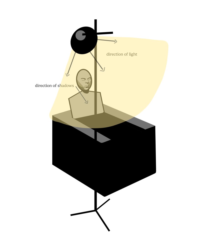
The other lighting in the room, coming from overhead, bounced into areas unlit by the lamp, which did soften and diffuse some of the shadows. Overall, though, we gave ourselves a clear division between light and shadow areas, with a light source that flattered our subject as she sat reading a book.
Drawing Process
Let me quickly walk you through my process of drawing from life this week. To begin, I again used a simple line drawing to determine proportions of the face, mapping out basic shapes of light and shadow.
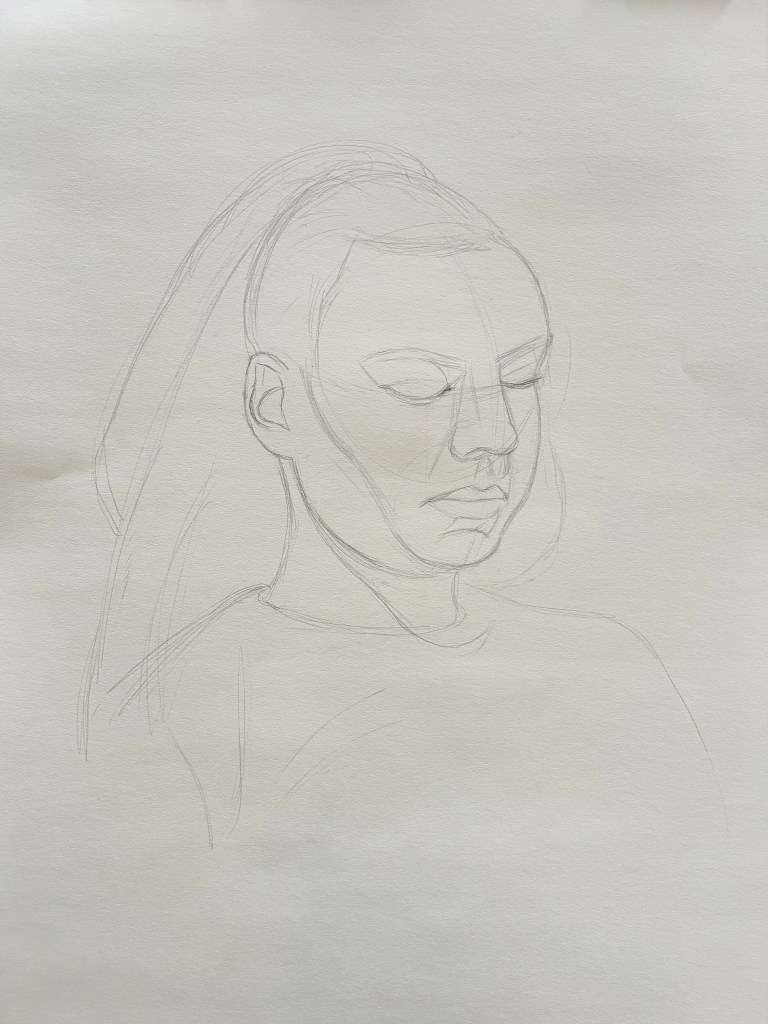
After I was pretty confident that my measurements were correct, I blocked in the darkest values, noting that the deepest shadows were below the nose, lower lip, chin, and eyebrows, and the brightest highlights on the forehead, edge of nose, and cheekbone.
Once more I was faced with the challenge of developing good value contrast between the darkest darks and lightest lights. With my last portrait, I reduced a tissue to smithereens by blending almost all the texture out of the charcoal, making values overly soft, smooth, and ambiguous. I tried to be more sparing with my blending tools this time, leaving some areas untouched to add texture and variety.
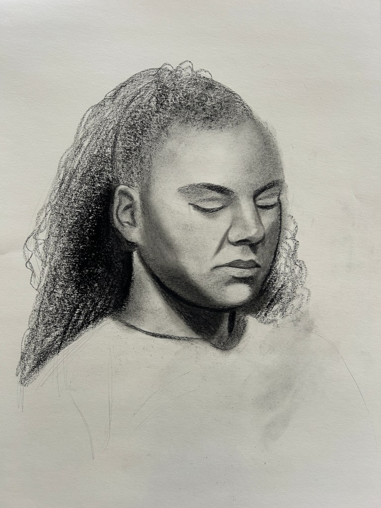
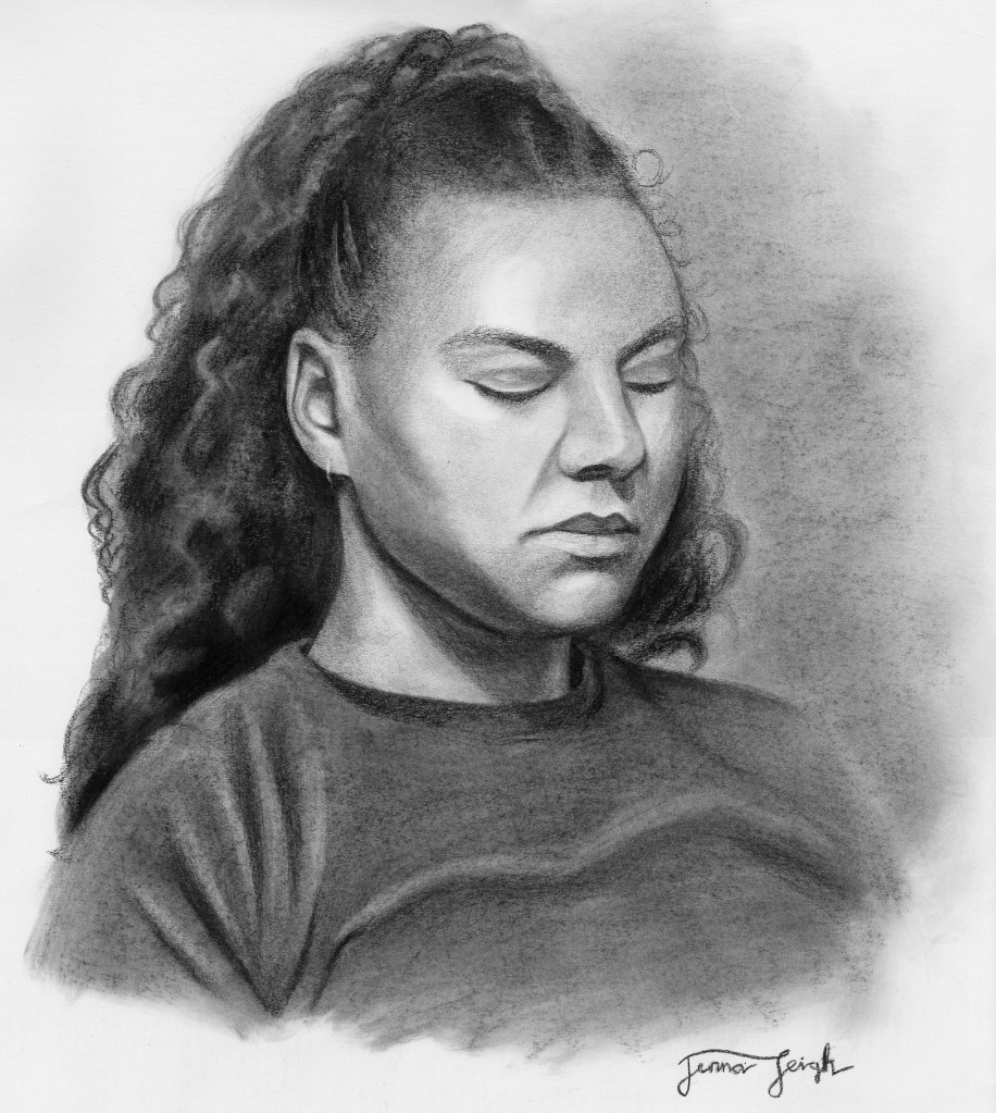
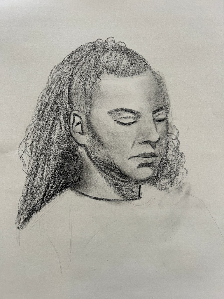
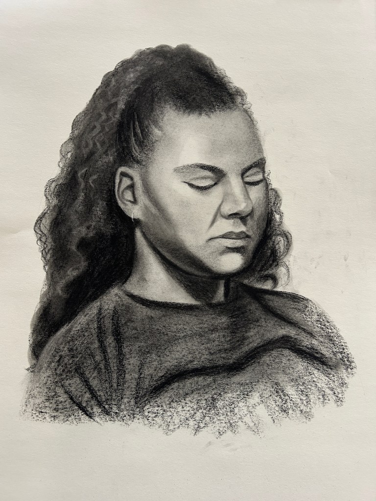
By the end of our live drawing session, I was decently happy with my progress, but I spent (probably too much) more time refining the portrait at home. Checking the mirror image revealed that her face was too full on the far side and too wide along the jawline, her neck was too thick, and one eye was too low, so I adjusted their proportion and placement (along with a good number of other renditions and adjustments that I won’t bore you with here). Here’s the portrait at the end of the live session:
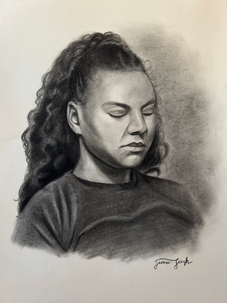
And here’s the finished portrait:
Reflection
Because we were focusing on light this week, I paid careful attention to the nuances of light and shadow on her face: soft transitions between form shadows, crisply defined cast shadows, reflected light under the cheek and chin. Intentionally looking for these qualities in my subject helped me better understand the interaction of the lighting with her form.
Since this was my second portrait assignment completed for the class, I felt more comfortable with my supplies, technique, and process, and more willing to take some risks. I still have a lot to learn and a lot of room to improve, but seeing my progress this week has been encouraging, and I am excited to tackle another challenge in the next.
Areas I feel more successful:
- simplifying hair
- smoothing skin texture
- quickly blocking in general face proportions as a connected whole
Areas I need continual improvement:
- establishing a strong/simple value pattern
- using measurement techniques to fix proportion issues
- adding more variety of texture and leaving darkest darks…dark
Next time, I want to:
- be bold
- take bigger risks
- try something new
- triple-check proportions before adding darkest darks
To a brand-new artist or someone who mostly appreciates, rather than executes, works of visual art, all this fine-tuning of technique, precision, process, and practice may seem like overkill.
Don’t you just…draw??
But it’s the same with any worthwhile skill or craft. If loved and enjoyed, it is a never-ending, abundant source of growth to the glory of God, a gift from Him to steward well for His kingdom until He returns.
How could I ever say “good enough”?
If art is something I’m called to do, it is something worth doing well. All these hours of learning and practicing and striving to improve will not go to waste. He has purpose for them, and He has purpose for me.
And I can’t wait to watch it unfold as I seek to follow in obedience…even just with charcoal.
(Thank you, Mary, for modeling!)

Leave a comment